Brand System
Ten values on a wall, five Japanese and five from New York. Every call I've made since has come back to which one it serves.
- Company
- Daikoku NYC
- Year
- 2022 – Present
- Role
- Founder & Executive Director
- Category
- Brand Identity / Design System
- Figma
- Adobe Illustrator
Context
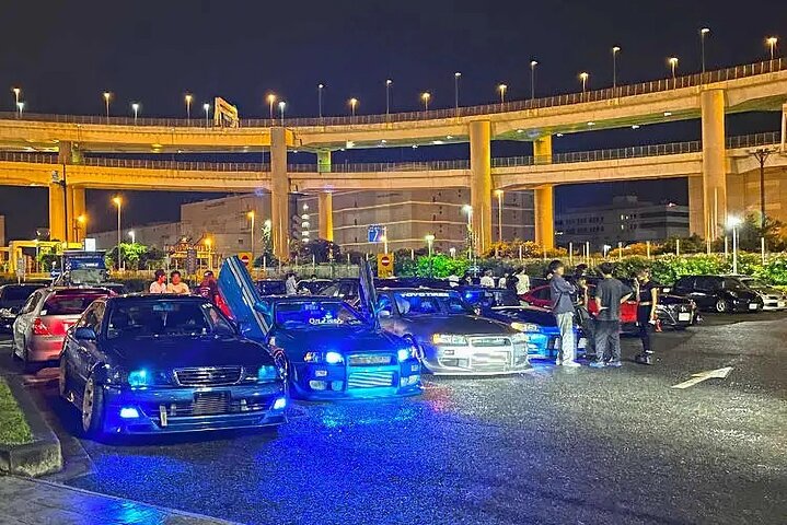
Daikoku NYC takes its name from Daikoku Parking Area in Yokohama, a place cars gather at night with nobody running it. The New York version needed the opposite. We were going to ask the city for permits and ask a community for trust, so we had to look like something.
The name and the line came first: Japanese Concepts. New York Mentality. Everything after it had to earn that sentence.
Problem
Bilingual brands usually cheat. One language leads, the other shrinks into decoration. Set it smaller, lighten the weight, tuck it underneath, and you've said which culture matters more. Here that would have contradicted the whole idea.
The bigger problem was who ends up using this. We're volunteer-run. The people applying the brand are a member laying out a flyer at midnight, a photographer writing a caption, a shop owner printing a sign for their window. Most of them will never ask me first.
So it couldn't live in my head as taste. It had to be written down well enough to follow, and tight enough that getting it wrong took real effort.
Solution
Ten values, paired, each tied to something we actually do.
Values are useless when they stay abstract, so every one points at a real practice. When a decision feels wrong, we ask which of the ten it broke.
Wabi-sabi, beauty in wear. The public registry only shows cars from the 1990s and earlier, and patina counts. One member has been rebuilding a 1991 Prelude for four years and says it isn't done and might never be. That's the point, not an excuse.
Kaizen, small steady improvement. Members run a weekly critique session where photographers post work and get it taken apart. Nobody shows up good.
Omotenashi, anticipating what someone needs before they ask. Approved drivers get their load-in time, the address and their staging block ahead of the day, plus a few places to eat nearby. Marshals place every car so nobody has to guess where to go.
Monozukuri, the craft of making. Engine bays painted by the owner, wheels powder-coated at home. It applies to us too. Merch gets made properly in short runs instead of printed cheap and stacked in a closet.
Ma, the pause between things. Before a parade rolls we hold two hours where the cars sit parked with engines off and people walk through. The quiet is scheduled.
Hustle and heart. Nobody draws a salary. Permits, insurance and filings get done at night by people who already worked a full day.
Neighborhood pride. Events happen where members are from. Chinatown Night Out on Division Street. A parade down Main Street in Flushing, not a rented lot somewhere neutral.
Immigrant stories. Heritage parades, a bilingual mark, a membership that's mostly first and second generation. The Japanese half of the logo isn't a style choice.
DIY spirit. No agency, no content team. Members shoot the events and make the flyers.
Urban resilience. Running legally in a city that shuts car meets down. Permits instead of pull-ups, a working relationship with the precinct, and the patience to keep doing it the slow way.
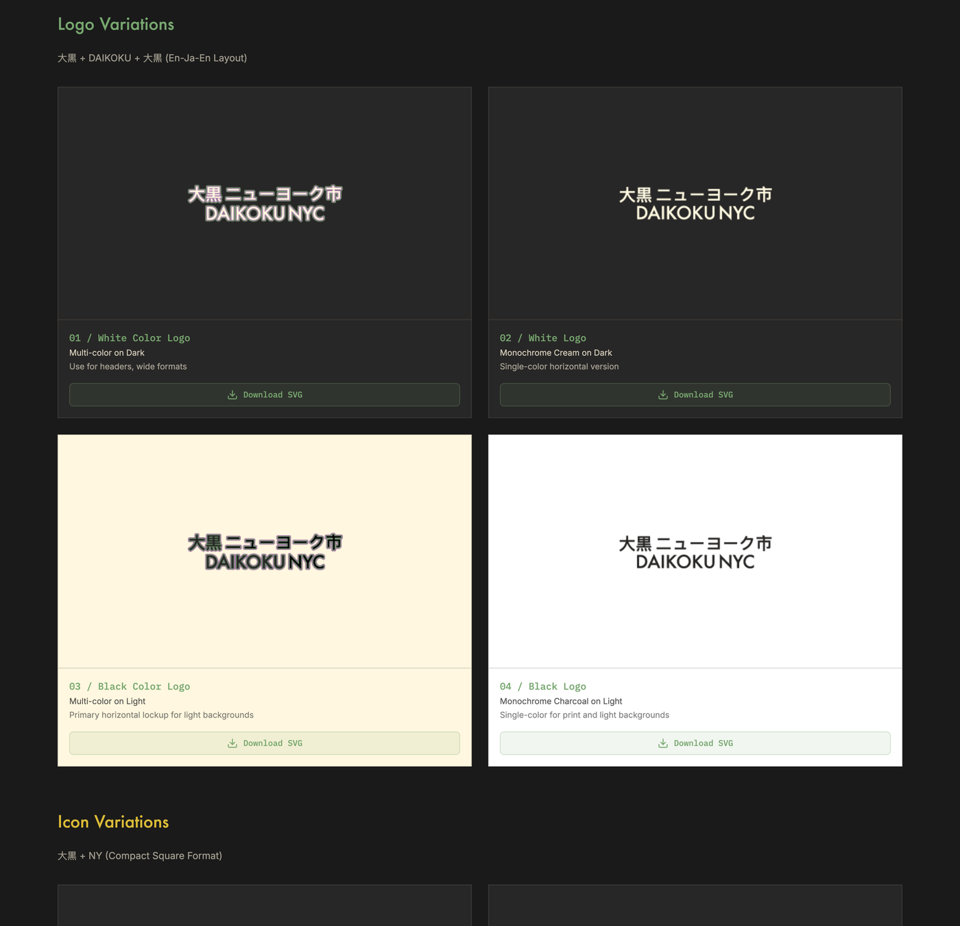
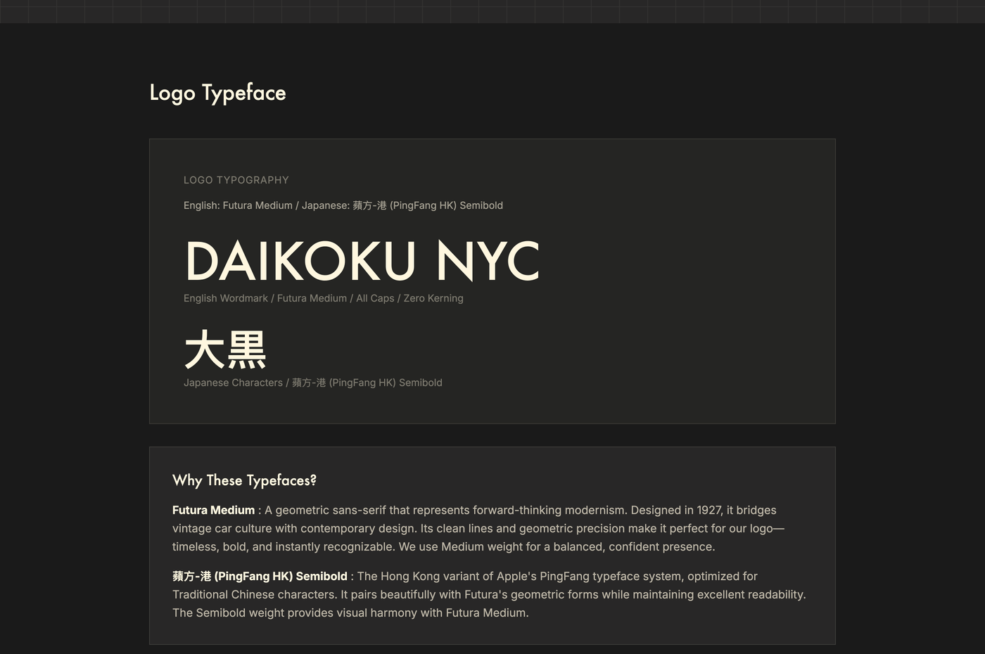
Both languages, same weight. 大黒 ニューヨーク市 sits in PingFang HK Semibold above DAIKOKU NYC in Futura Medium. A geometric sans from 1927 against a Traditional Chinese face, balanced so neither one looks like the caption for the other.
Matching them was the hard part. The two faces build strokes differently and read at different weights even at the same point size, so I balanced them by eye and checked at small sizes where the mismatch shows first. Eight versions cover dark, cream and light backgrounds so nobody has to improvise the mark for a surface it wasn't drawn for.
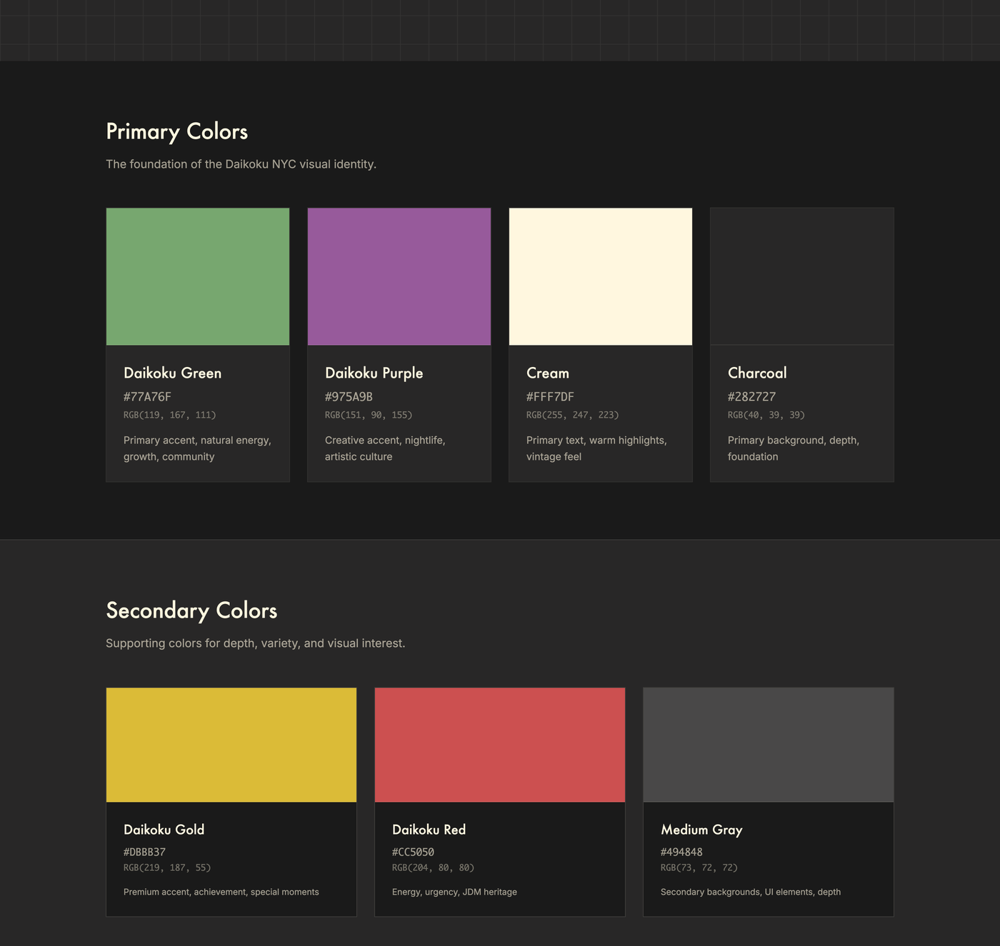
Seven colors, each with a job. The palette is dark first because that's when we gather.
Green is community and the main accent. Purple is nightlife and the creative side. Cream carries text and warmth, and we never use pure white. Charcoal is the ground everything sits on. Gold is for milestones only. Red is energy and JDM heritage, used sparingly. Gray holds the secondary surfaces.
Naming the job instead of the swatch is what makes this usable by someone who isn't a designer. Tell a volunteer to use green and they guess. Tell them green means community and they can decide for themselves.
Say what the brand refuses to be. Not a car club with ranks. Not cover for street racing or takeovers. Not a business. Not exclusive.
Those four lines went in alongside the values, not afterward. They're the reason a member can post for the organization without checking with me. The boundaries mark what's out, so everything inside is safe.
Customer Journey
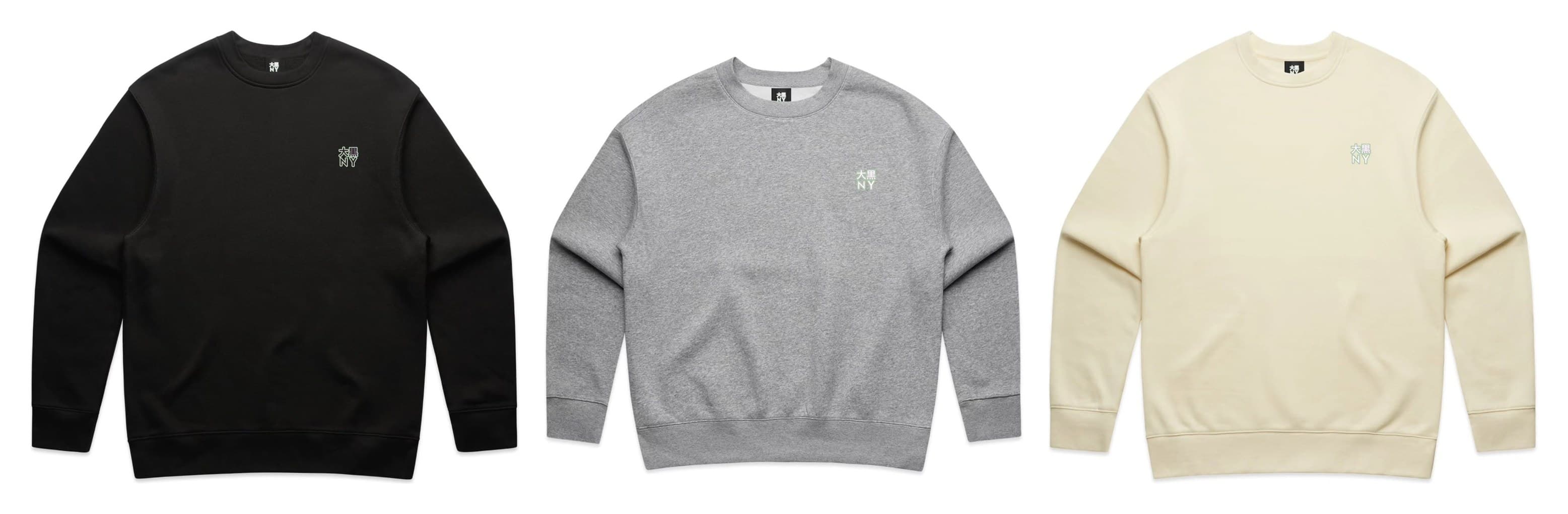
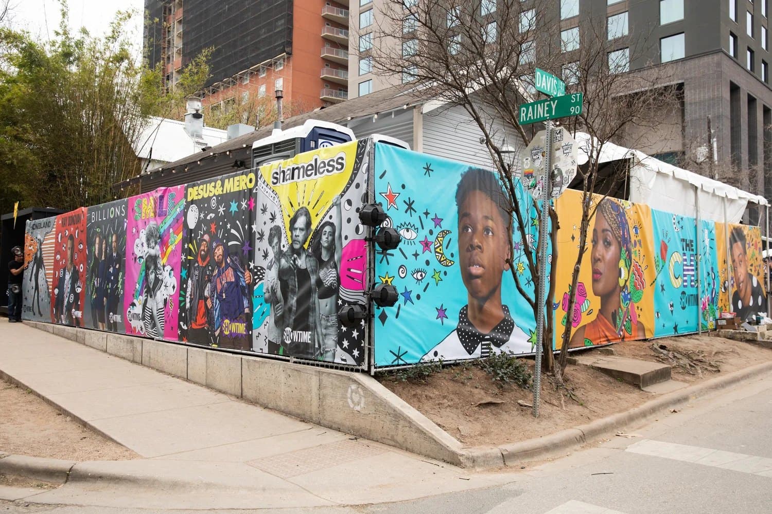
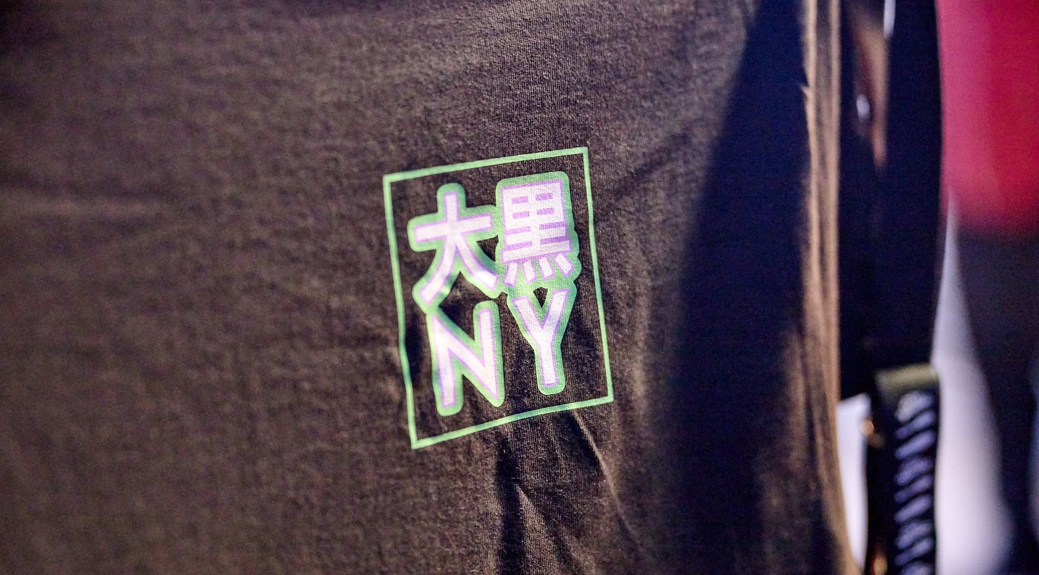
Almost nobody meets this brand in a deck. They meet it on a flyer, on a crewneck at a block party, on a permit application, on a sign taped in a shop window, or in a caption somebody else wrote.
That spread is why the system leads with rules instead of a look. A look has to be interpreted. A rule can just be followed.
The test I kept using: could a member who has never spoken to me get this right on their own? If the answer needed a phone call, it wasn't finished.
Impact
The identity has held for four years in the hands of people who mostly aren't designers. Flyers, merch, permit paperwork, partner signage, parade lineups, press.
It cleared the bar that mattered most. An unknown car group walking up to New York City gets filed into a category before anyone reads the mission. Looking like an institution instead of a crew is part of why the permits and partnerships happened at all.
Learning
The refusals turned out to be worth more than the palette.
I assumed the wordmark would be the center of this, because that's where the craft went. In practice people quote the four lines about what we're not, and those are what let them act without me.
The other lesson was about users. I've built identities where the client's brand team was the only one touching it. Here the users are volunteers, partners and members, and that changes what finished means. Finished isn't a locked logo file. It's the night somebody uses it correctly without calling.