Showtime House at SXSW
An illustration system that turned Showtime's locked key art into a festival identity, then built a three day house around it on Rainey Street.
- Company
- Showtime
- Year
- 2019
- Role
- Senior Art Director (Freelance)
- Category
- Campaign Identity / Brand Activation
- Adobe Photoshop
- Adobe Illustrator
Context
SXSW 2019 drew roughly 417,400 participants to Austin and put an estimated $355.9 million into the city. Showtime went in with a slate rather than a single show: The Chi, Black Monday, Shameless, Billions, Ray Donovan, Homeland, SMILF and Desus & Mero, alongside the documentaries Shangri-La and Wu-Tang Clan: Of Mics and Men.
From March 11 to 13, the network took over Clive Bar on Rainey Street and ran it as the Showtime House. I came in on the concept side, before there was a visual approach.
Problem
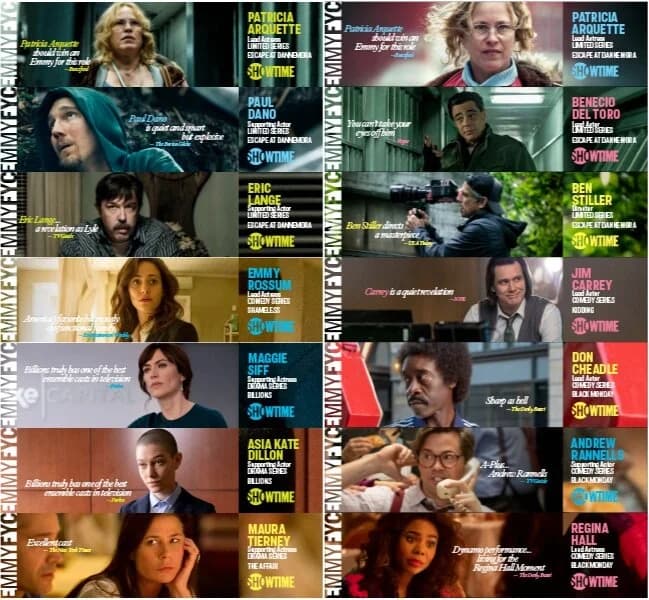
A network slate has no shared visual language, and that is deliberate. The Chi is a Chicago street drama shot warm and documentary. Black Monday is a 1980s trading floor farce. Homeland is a thriller. Each show's key art is engineered to look like nothing else on the network, because that is how a viewer tells them apart on a shelf.
At a festival, that strength inverts. Put eight shows' key art along one fence and it reads as eight unrelated ads sharing a wall, not one network showing up. The obvious correction is to bury the shows under network branding, which produces the opposite failure: a wall of logo that tells a passerby nothing about what Showtime actually makes.
And there was a hard constraint underneath both options. Key art is locked. The photography was already shot, approved, and in market. Nobody was going to reshoot eight casts for three days in Austin.
Solution
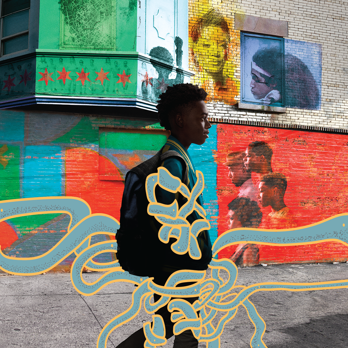
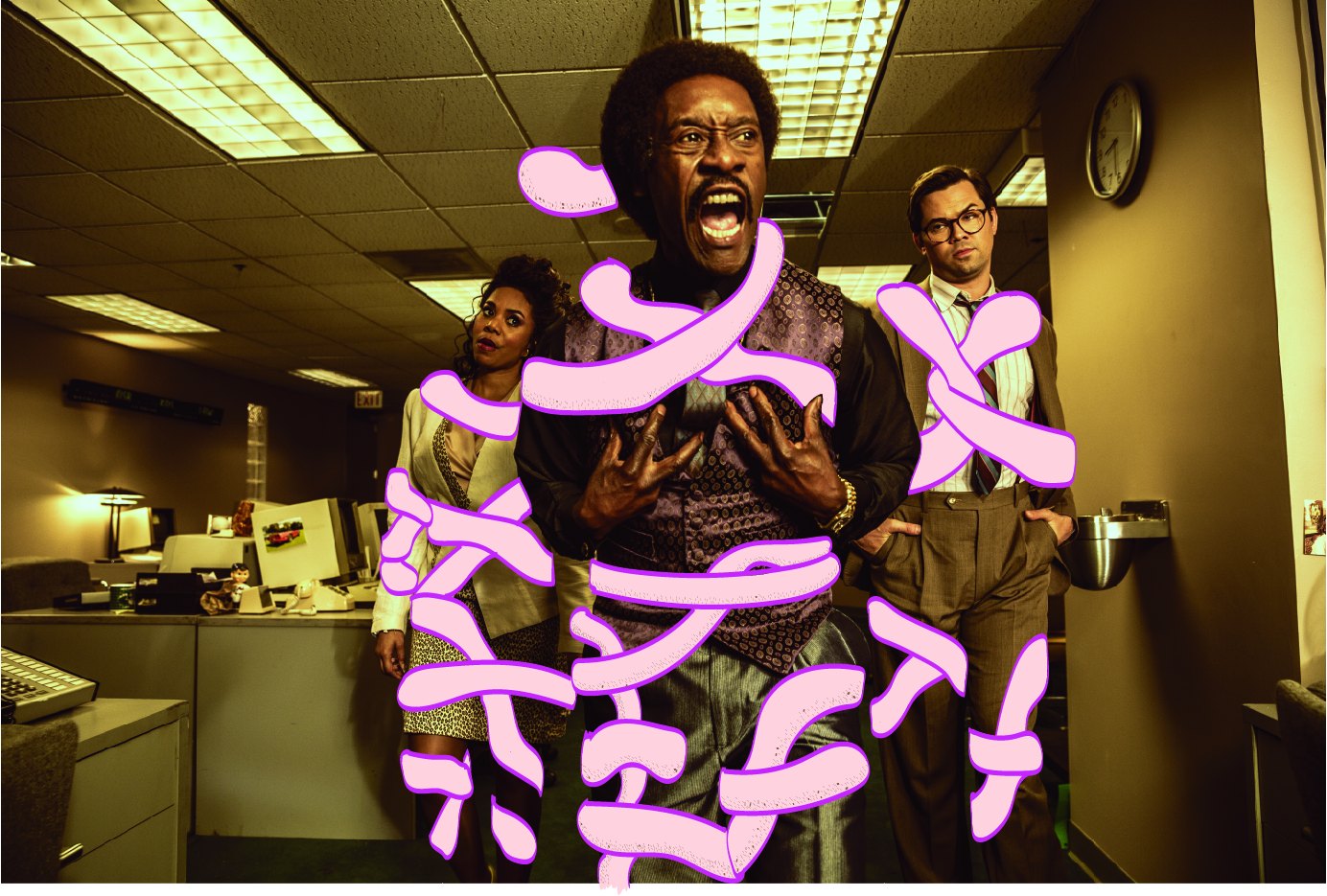
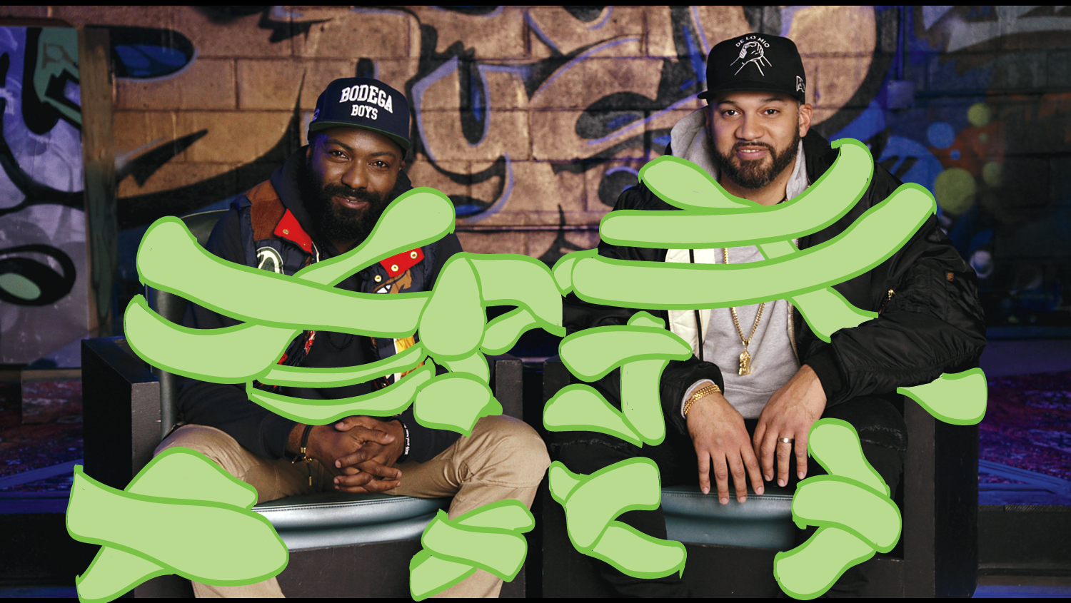
I took three pieces of existing key art and illustrated directly on top of them, to show what a shared layer could do. The Chi, Black Monday, and Desus & Mero: the same approved photography, with a loose hand drawn layer sitting over it.
That was the whole proposal, and it worked by turning the constraint into the mechanic. If the photography cannot change, stop trying to unify the photography. Unify what sits on top of it. A drawn layer costs almost nothing to produce, needs no new talent imagery, and can be applied to any asset that already exists. It also does the specific thing a festival identity has to do: it reads as a hand rather than a template, which is the difference between a wall people photograph and a wall people walk past.
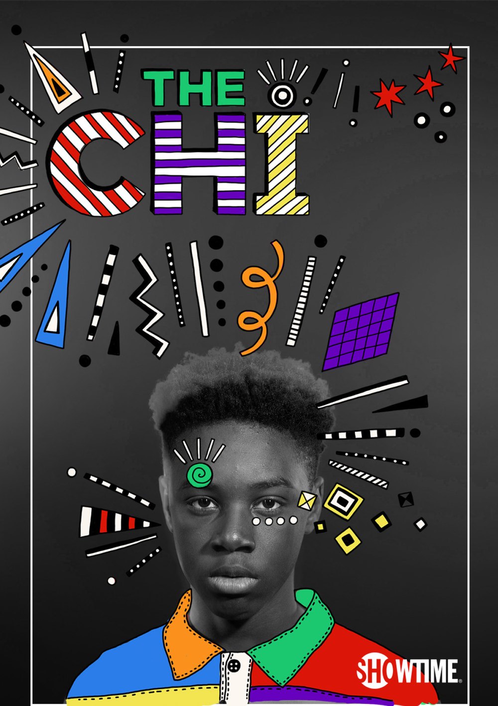
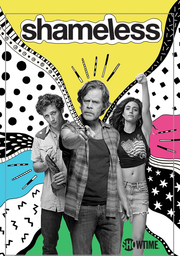
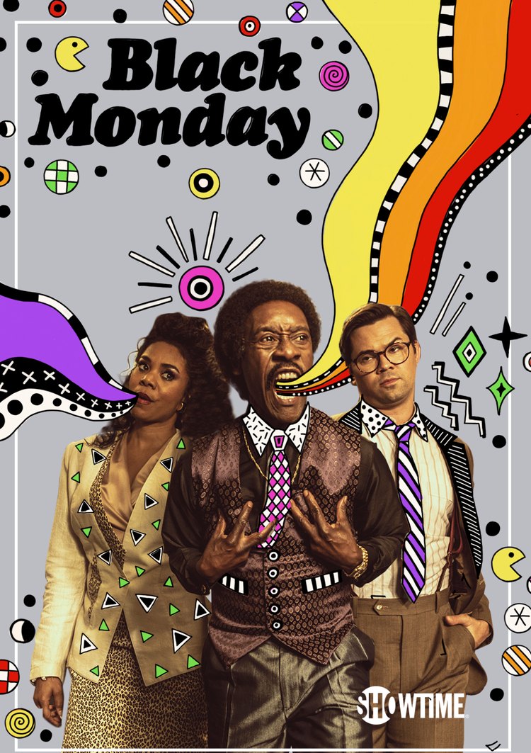
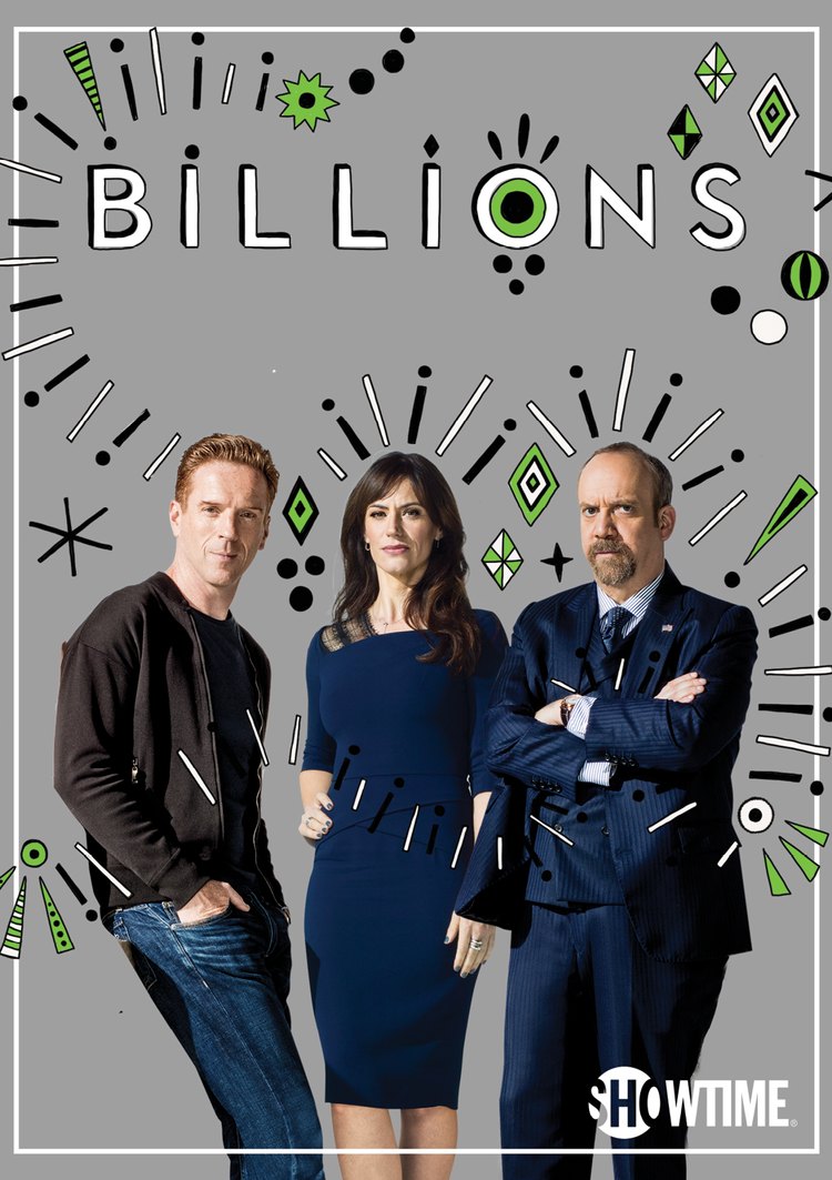
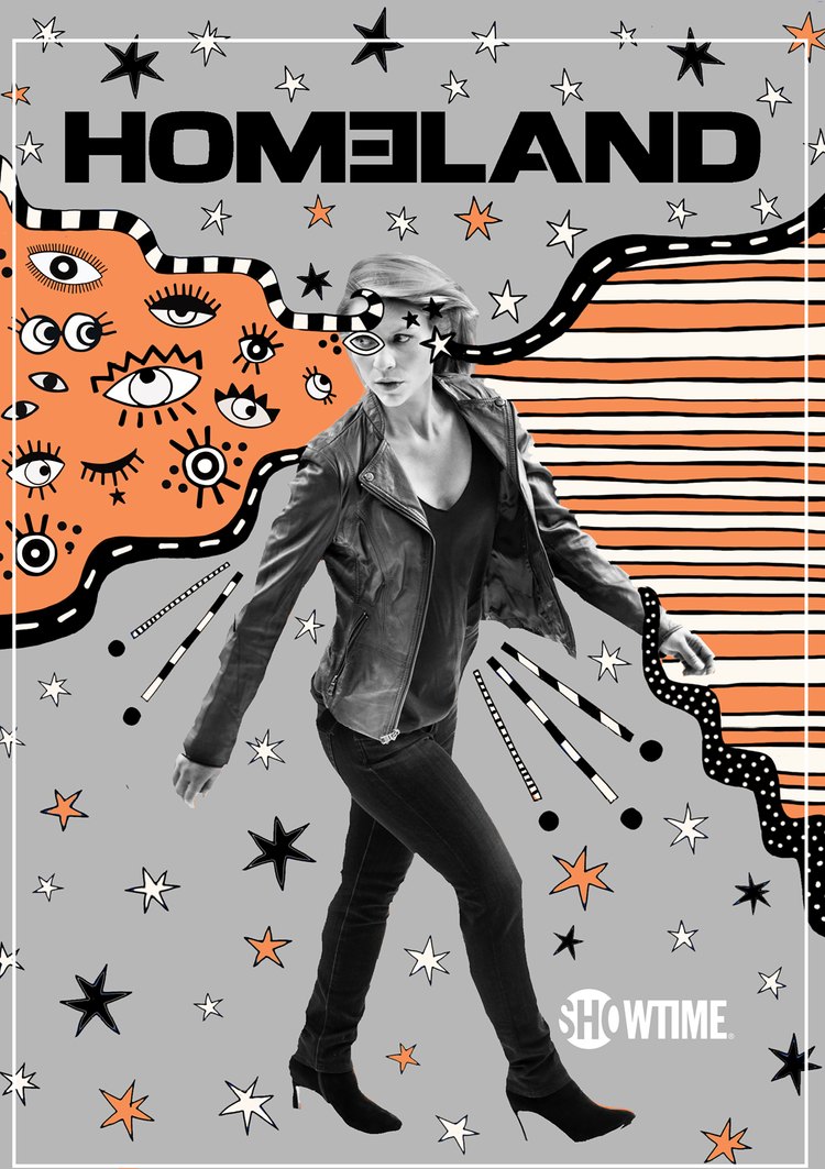
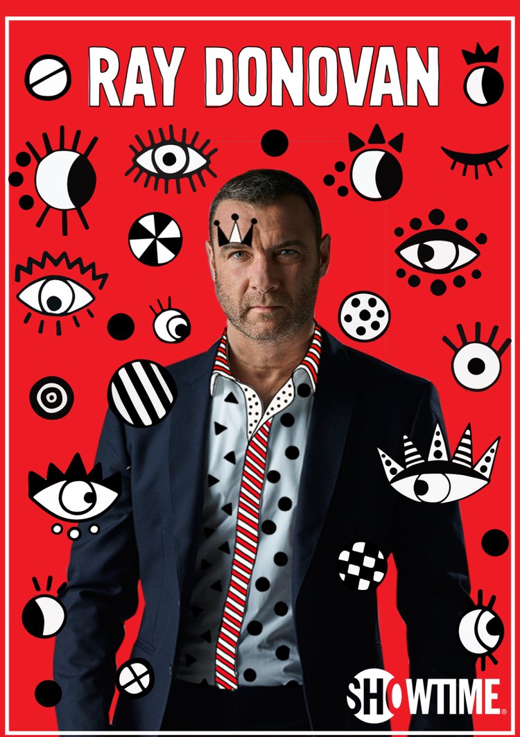
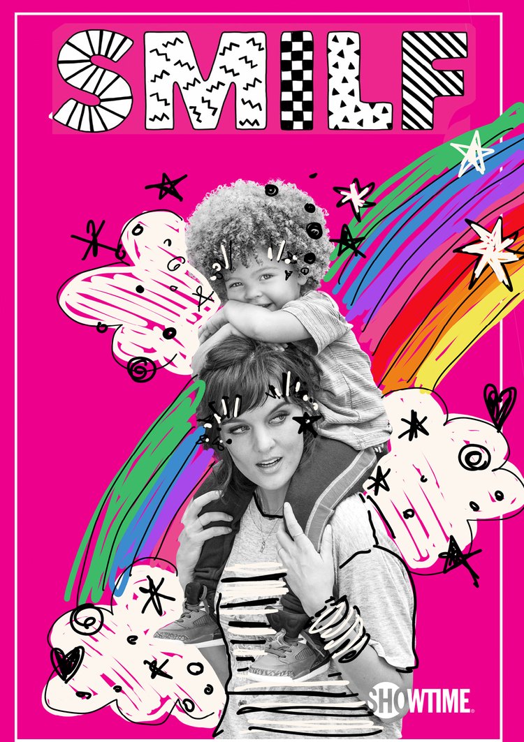
Showtime brought in Brazilian artist Ana Strumpf to make it real, and her execution went past what the treatments had shown. Where I had drawn over color photography, Strumpf desaturated the photography to black and white and let the illustration carry every bit of color in the frame.
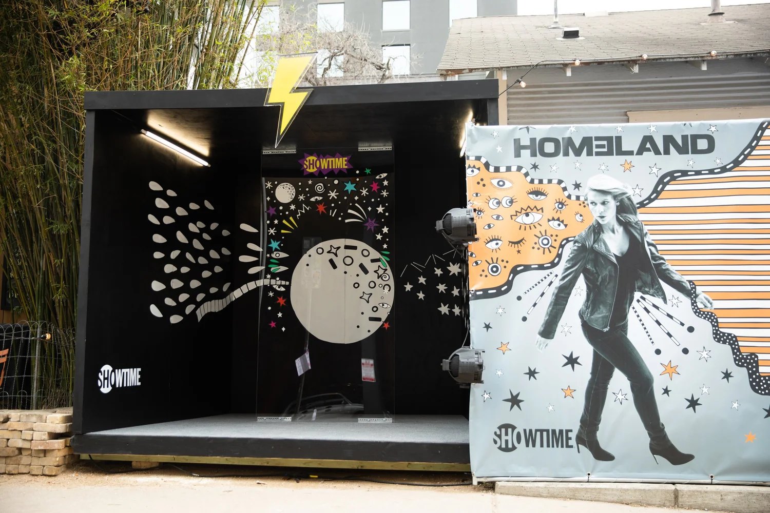
That one move is what turned a technique into a system. With the photography neutralized, each property could hold its own palette while a shared vocabulary of marks held the set together: stars, eyes, zigzags, dotted rules, sunbursts, and hand lettered logotypes. The Chi on charcoal in red, purple and green. Shameless in yellow. Black Monday in purple and gold. Different worlds, unmistakably one hand.
Customer Journey
An identity built to travel is really a set of rules about what survives a change in size. This one got tested at both ends of the range.
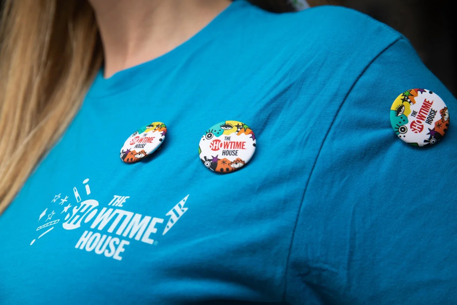
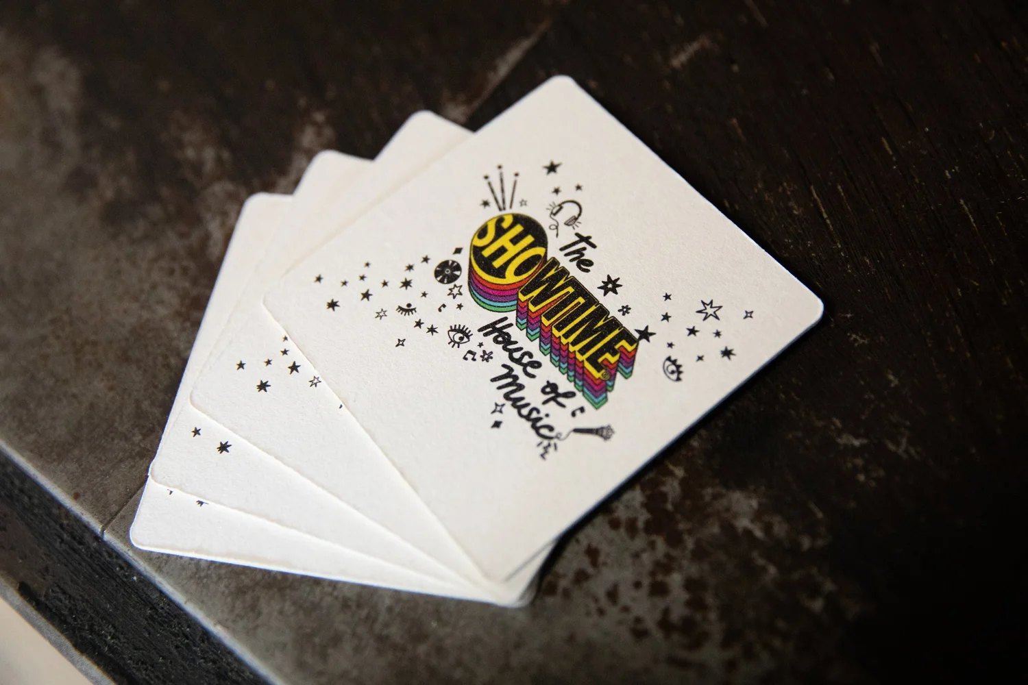
Small: buttons, playing cards, t-shirts, badges, digital placements, and an official Showtime and Ana Strumpf sticker pack that put the illustration vocabulary directly into people's social posts as a native asset rather than an ad.
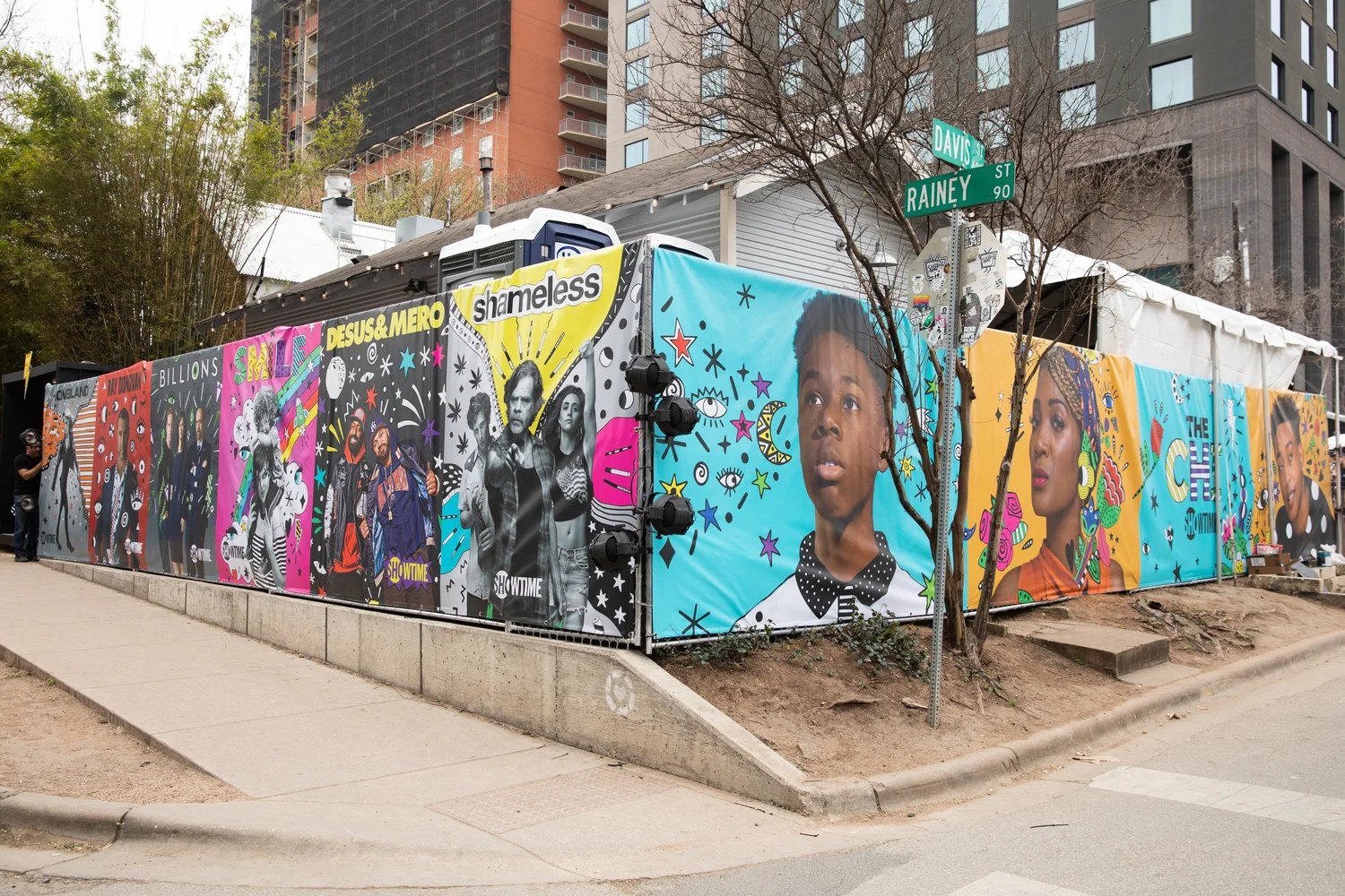
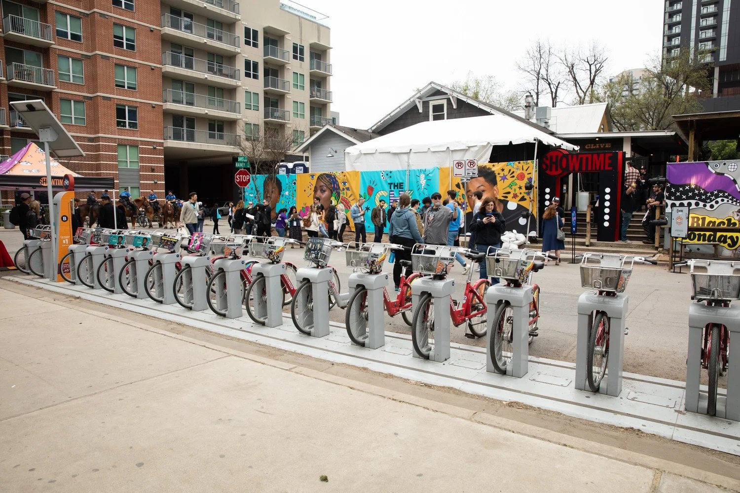
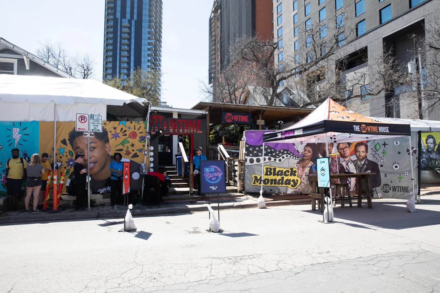
Large: posters, tents, bus and structure wraps, and the perimeter of the House itself, where the full slate ran continuously around the fence at Davis and Rainey. That fence is the clearest evidence the system worked. Eight properties in a row, each one visibly its own, and not one of them looking like it belonged to a different campaign than its neighbor.
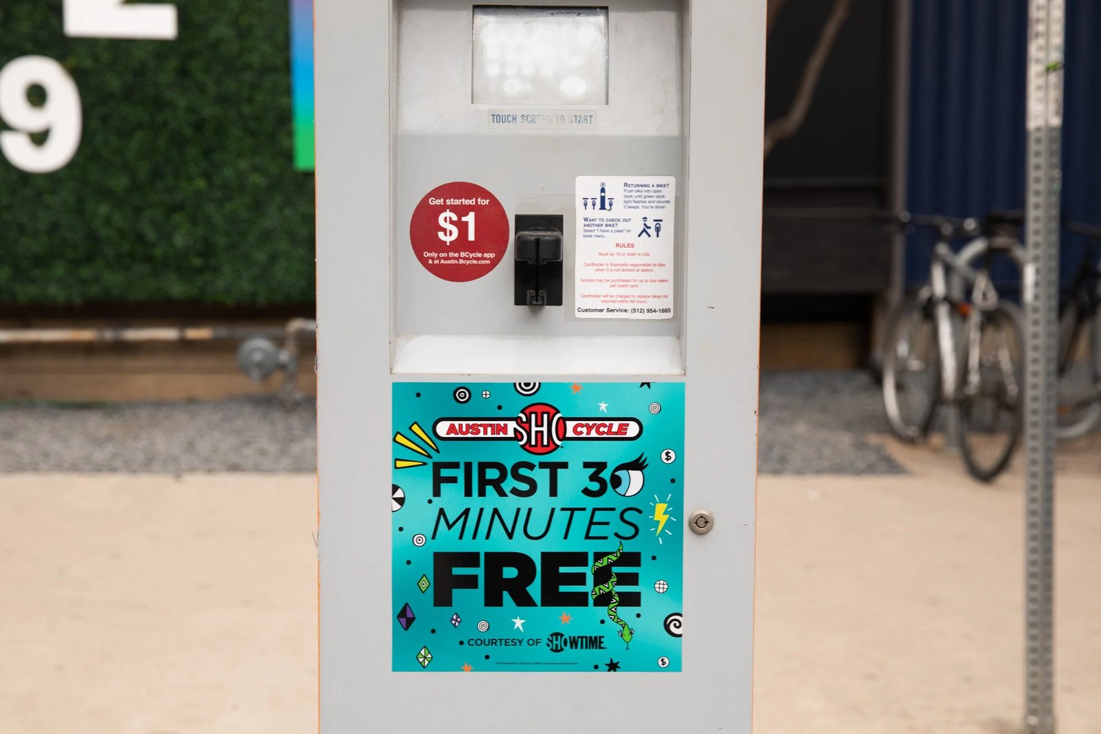
In between, the parts of a city nobody designs for: parking meters, and the ShowCycle bikes that carried the identity around Austin instead of waiting for Austin to walk past it.
Impact
The campaign did not stop at print and out of home. The Showtime House is where it stopped being artwork and became a place.
Showtime took over Clive Bar, an outdoor venue on Rainey Street, for three days, and ran it as a Collide on Rainey St. address rather than a branded box. The approach to it does the first piece of work. There is no entrance wall with a logo on it. There is a city block whose fence has become the campaign, running the full slate around the corner of Davis and Rainey so that people walking to something else pass eight shows at eye level. Inside, tents and structures carry the same illustration language, so a Black Monday tent and a Homeland structure are recognizably different rooms of one house.
What made it work as an experience is that the art was unfinished on purpose. Live mural painting ran across the three days, which means a visitor did not arrive at a finished backdrop, they arrived at something being made while they stood in it. On March 12, Secret Walls staged a live illustration battle in the space: two artists, one from New York and one from Chicago, ninety minutes, black and white only. That is the campaign's own logic, black and white with the color added by hand, performed as a competition in front of a crowd.
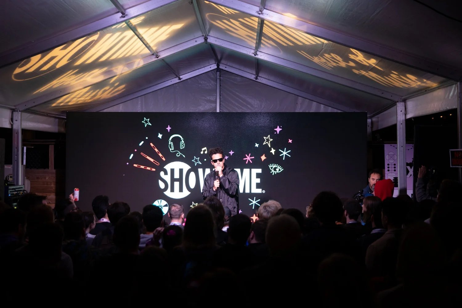
Talent turned up in the space rather than on a stage above it. Jacob Latimore from The Chi. Paul Scheer from Black Monday. The programming ran on a day-to-night rhythm: public daytime programming, including a Shameless carnival day with a quickdraw photo booth and face painting, then music at night, with Mavis Staples and DJ Spinderella playing and Francis and the Lights headlining.
The design decision underneath all of it is that people were given something to do rather than something to stand in front of. A step-and-repeat asks a visitor to pose against a brand. A mural being painted, an illustration battle, a carnival booth, and a bike you can ride away on all ask them to participate in it. That is the difference between a backdrop and an environment, and it is why the art reads as the reason people were there rather than the decoration around the reason.
The activation ran the full three days, was listed on SXSW's official schedule, and set the pattern Showtime carried into its later artist collaborations at the festival. SXSW 2019 drew roughly 417,400 participants to Austin, and the House was built to be worth walking into for any of them, not only the people who already had a subscription.
Learning
The value of the concept was not the drawing. It was the reframe. "The photography is locked" sounds like a limit on what the identity can be, and it turned out to be the specification for it: unify the layer you are allowed to add, not the layer you cannot touch.
The second lesson is about handing work off. The strongest version of this was not the one I drew. It was the one Strumpf made when she took the mechanic and found the move I had missed, pulling the color out of the photography so the illustration could own it. A concept that only works when you execute it yourself is not a system.
The third came from the House itself. What made it somewhere to be, rather than a venue with a logo on it, was leaving the work visibly unfinished. Anyone can rent a bar for three days. Painting the mural in front of people is what turned a sponsorship into a place.
Credits
Illustration and campaign artwork by Ana Strumpf. The Showtime House ran at Clive Bar, Rainey Street, Austin, March 11 to 13, 2019, as a Collide on Rainey St. venue.