Key Art
A poster is one file. Key art is a system that has to survive a phone, a billboard and a DVD spine without being redrawn each time.
- Company
- Showtime
- Year
- 2018 – 2019
- Role
- Senior Art Director (Freelance)
- Category
- Key Art / Brand Systems
- Adobe Photoshop
- Adobe Illustrator
Context
Across 2018 and 2019 I was the senior art director on key art at Showtime, working on three jobs that look the same and are not: a scripted series slate, a live boxing schedule, and a documentary slate with no cast to photograph.
Key art is the single image a show is sold with. It is the thumbnail in an app, the poster in a lobby, the banner on a homepage, the billboard, the disc face. One drawing, dozens of places, none of which agree on shape.
Problem
The job gets described as making a poster. That description is what makes it go wrong.
A poster is one file at one size. Key art has to survive two extremes without being redrawn. At 120 pixels wide, in a grid of competing thumbnails, the title still has to be readable and the face still has to register. At forty feet over a freeway, the same composition cannot look like a small thing enlarged.
The shapes fight each other too. Horizontal placements want the subject off to one side, with room for type. Vertical placements want the subject centered and the type stacked. Cropping one into the other usually cuts the subject in half or throws the title away.
And it never ships once. Every title comes back for a date change, a new credit block, a partner logo, a festival laurel. If each of those is a fresh design decision, the work never ends and the art drifts.
Solution
Ship templates, not posters.
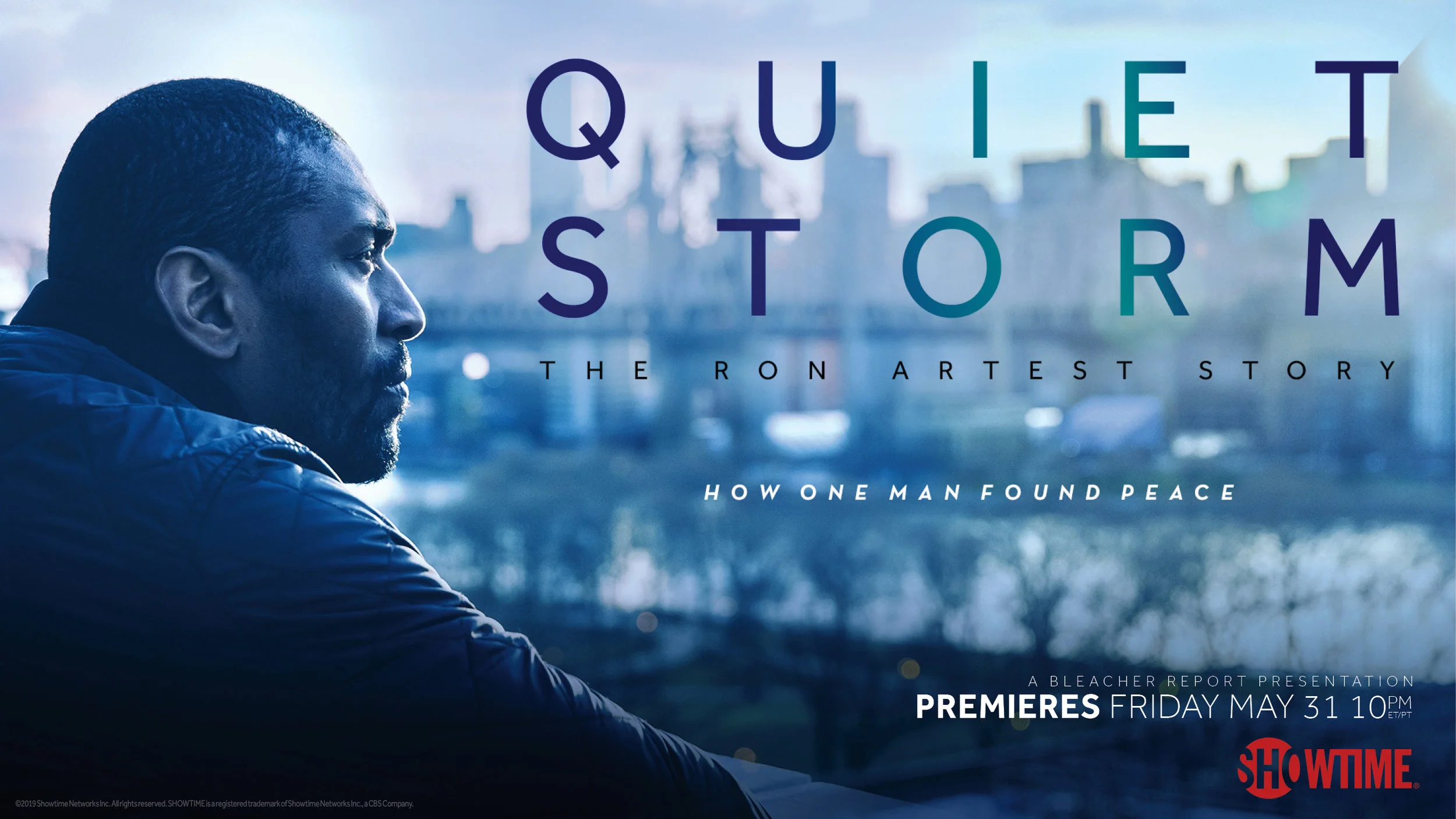
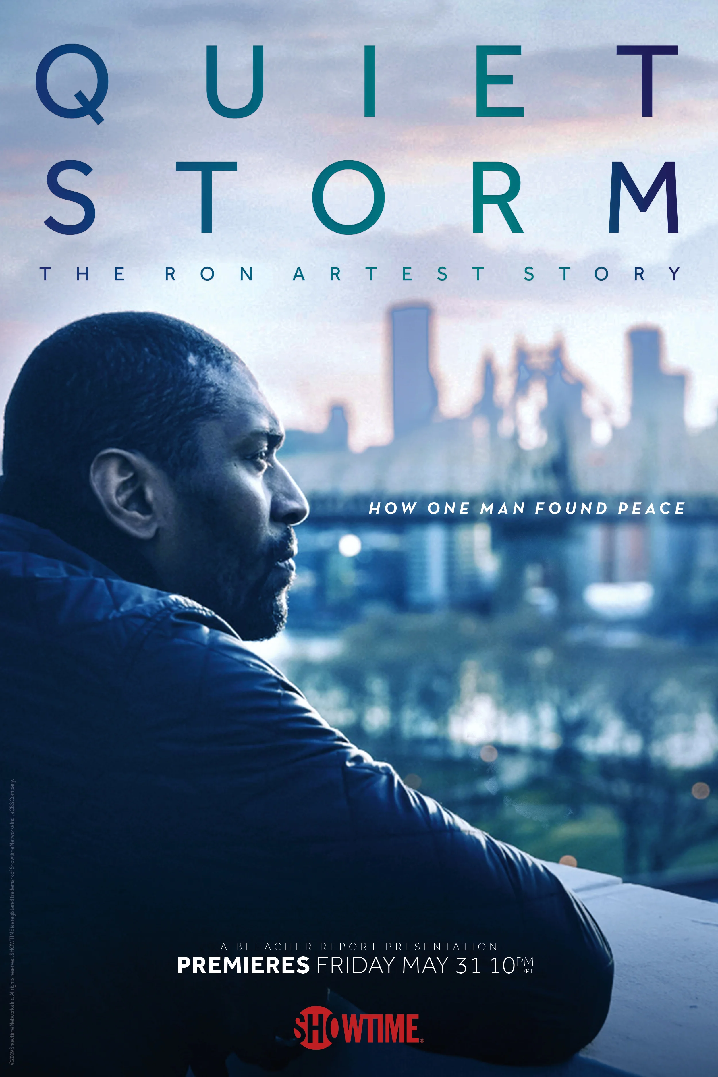
Every title went out as a set of format templates rather than one approved image. Quiet Storm shipped as a horizontal and a vertical, each built for its own shape rather than cropped from the other. Type hierarchy, safe areas and the credit block were already positioned in both.
That is what makes a date change survivable. When the premiere moves, or a partner logo has to go on, the answer is a slot to fill rather than a redesign. The person filling it does not have to be me, and does not have to guess.
The title is built the same way. On Quiet Storm the wordmark is tracked wide across two lines, so the letters never collide when it shrinks. A gradient runs through the letterforms, which gives the type its own presence at sizes where the photograph has gone muddy.
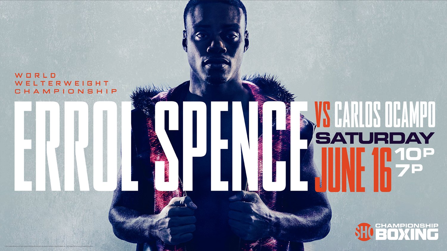
Boxing: the art is a schedule.
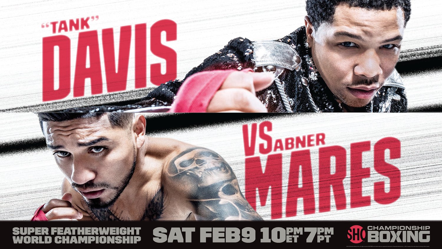
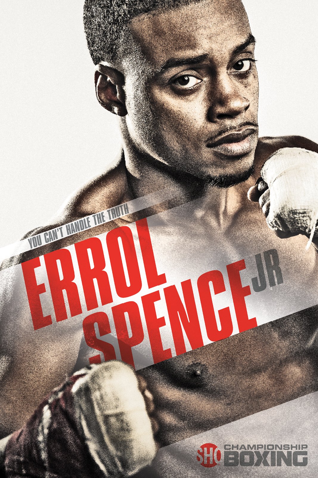
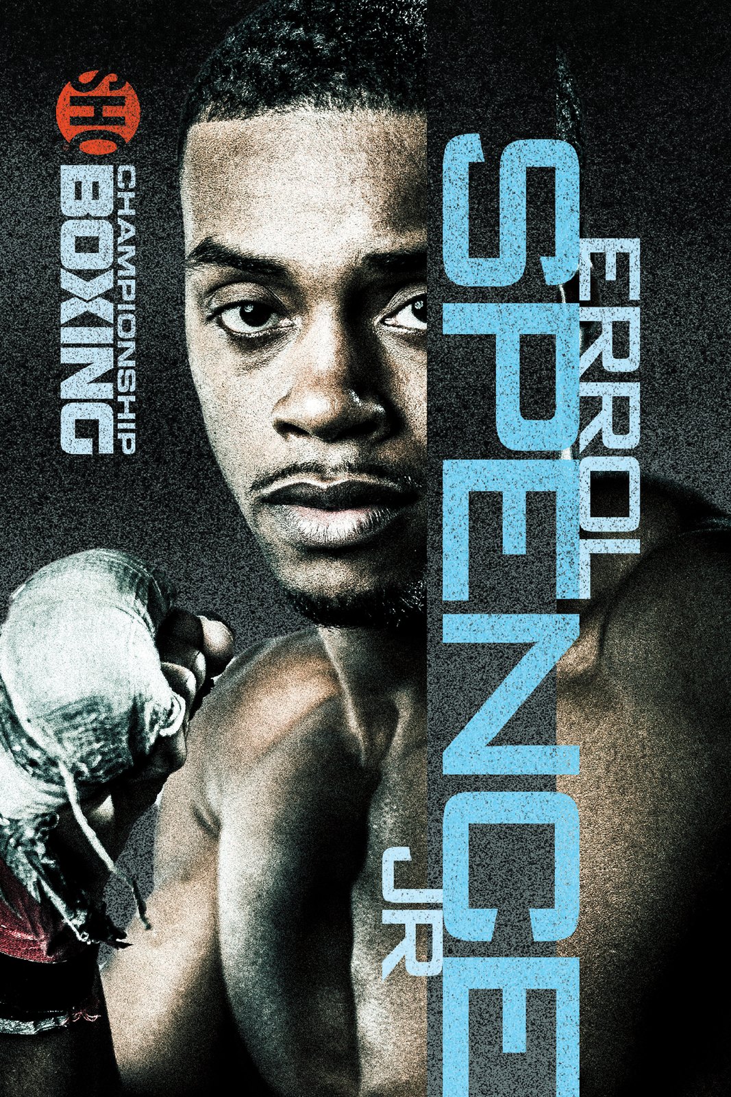
A series poster sells a mood. A fight card sells an appointment. It has to carry two fighters, a weight class, a date, a start time in two zones and the network lockup, with none of it reading as fine print.
So the names become the image. Both fighters run at display size, the bout sits between them, and the date block is the only element allowed to break the color scheme. Formats then split by placement: a diagonal two-fighter split for horizontal, single portraits for vertical.
Boxing also moves in days rather than weeks. Fights get announced, undercards change, times move. A layout you have to redraw each time cannot keep up with that. This is where templating stopped being tidy and became necessary.
Documentary: no cast to lean on.
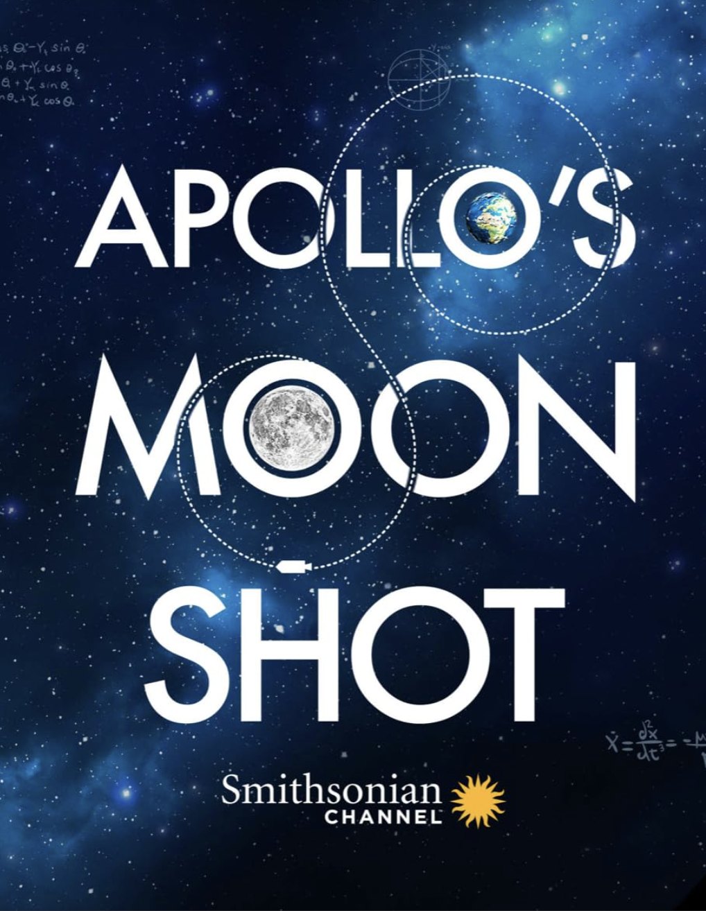
The Smithsonian titles have no stars, and often no usable production stills. The concept has to live in the type and one image. On Apollo's Moon Shot, Earth and the Moon take the two O's and the trajectory runs as a dotted path between them. The title is the diagram.
Desus & Mero: the brand leaves the screen.
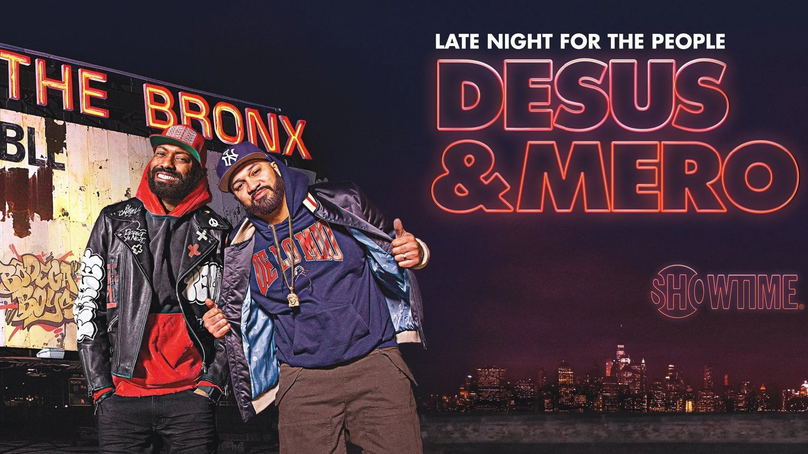
This one came with the identity attached: key art, logotype and promotional line. The logotype is drawn as neon outline, which suits a late night show and survives being printed in one color on anything.
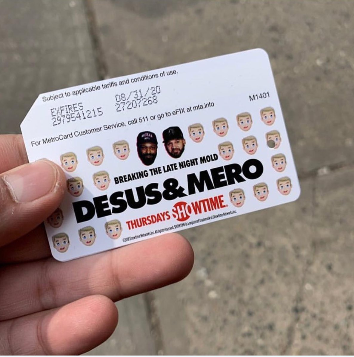
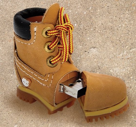
That mattered because the job was to make a New York object, not a New York advertisement. The show is Bronx to its core. So the merch went where the audience already was: a co-branded MetroCard, and a Timberland boot that opens into a USB drive. Neither is a logo stuck onto a generic item. Both are things the audience already carries.
Wu-Tang: designing from someone else's art.
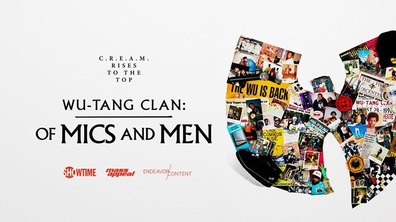
I was brought on to create the key art for the docuseries and took it through several rounds. Wu-Tang wanted the art made inside their own circle, and it went to Mass Appeal, who produced the series. The key art on that campaign is theirs, not mine.
What came to me was everything after it. I built the out-of-home campaign from the approved art: billboards, bus sides, bench placements, every format the campaign ran in.
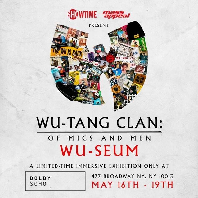
That is a different problem from designing the art, and a harder one than it sounds. The composition was fixed and not mine to change, and it had to work in shapes it was never drawn for. A bench is nearly square. A bus side is a long ribbon. A billboard has a fixed safe area and a viewing distance measured in car lengths.
The square Wu-Seum layout shows it clearly. Horizontally, the collaged W sits beside the title. Square, there is no beside. The W moves up, the title stacks under it, and a venue, an address and a four day run all get added to a composition that reserved no space for them.
Customer Journey
Key art is almost never looked at. It is passed.
Someone scrolls a row of thumbnails and one of them stops them. Someone waits at a bus stop with nothing else to read. Someone drives past a billboard at fifty. In each case the art gets about a second, and the viewer is not trying.
So the hierarchy is set by the worst case rather than the best one. If the subject and the title do not survive a 120 pixel thumbnail, nothing else in the composition matters, because the thumbnail is where most people meet it. Anything that only works at poster size is a bonus on top of that.
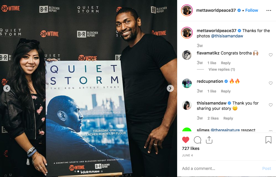
Quiet Storm left the frame entirely and became the event poster at the screening, standing next to Metta World Peace. That is the version of this work where the subject is holding the argument you made about him.
Impact
Key art across the documentary, sports and series slate through 2018 and 2019, shipped as reusable format templates rather than one-off posters.
Quiet Storm ran as a Showtime Sports and Bleacher Report presentation, premiering 31 May 2019, and carried through to the screening event and its press.
The Wu-Tang docuseries campaign ran on the out-of-home system I built from Mass Appeal's key art.
Learning
Losing the Wu-Tang key art was the most useful thing that happened in this job.
Being told that the artist's own creative company would make the art is a reasonable call, and arguing with it would have been the wrong instinct. What was left was the part most people treat as leftovers: adapting someone else's composition into every format the campaign needed. That turned out to be where the actual design problem was, and it is the part I would show now.
The other lesson carried straight into product work. A template is not a shortcut, it is the deliverable. The value here was never the individual images. It was that a date change, a new partner logo or an unplanned format did not need a designer to reopen the file and make a judgment call. That is the same argument as a component library, made three years before I was making it about components.