Emmy FYC Campaign
One layout, thirteen nominations, six shows. The campaign had to look like one network making one argument, while every show inside it kept its own face.
- Company
- Showtime
- Year
- 2019
- Role
- Senior Art Director (Freelance)
- Category
- Campaign System / Art Direction
- Adobe Photoshop
- Adobe InDesign
- Adobe Illustrator
Context
Every year between the nominating ballot and the final vote, the networks run For Your Consideration campaigns. The audience is not the public. It is roughly ten thousand voting members of the Television Academy, most of them in Los Angeles, most of them working in the industry, and all of them looking at the same billboards on the same drive to the same offices.
Showtime went into the 2019 Emmys with six series in play: Escape at Dannemora, Kidding, Black Monday, Shameless, Billions and The Affair. Across them sat more than a dozen individual performances to campaign for, from Patricia Arquette and Ben Stiller on Dannemora to Jim Carrey on Kidding and Don Cheadle on Black Monday.
I art directed the campaign, and produced the print and video that ran in out-of-home.
Problem
A network FYC campaign has to do two contradictory things at once.
It has to read as one network making one argument. A voter who sees six unrelated designs learns nothing about Showtime; they just see six shows that happen to share an airdate. The campaign is the network's case for itself, and a case has to have a single voice.
But each show also has to keep its own face. Escape at Dannemora is a bleak true-crime limited series shot in upstate winter. Black Monday is a loud 1980s comedy in pink and gold. Kidding is Jim Carrey playing quiet devastation in a children's TV cardigan. Flattening those into one house style would misrepresent every one of them, and a voter who cannot tell the shows apart cannot vote for one.
Then the practical constraint underneath both. The same campaign had to run as a billboard on Sunset, a full page in the trades, a DVD screener that arrives in a box at someone's house, a vertical video on a phone, and a digital board 2732 pixels wide and 330 tall. Those are not one design resized. They have wildly different reading distances, dwell times and crops, and a layout that works on a page falls apart at eighty feet.
Solution
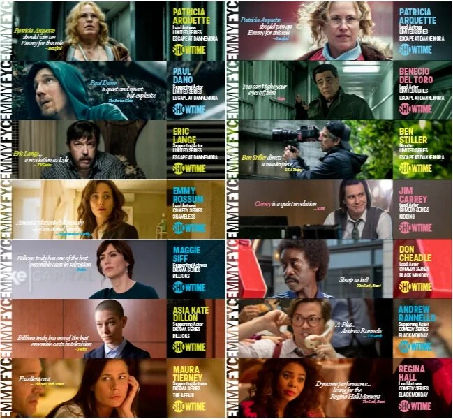
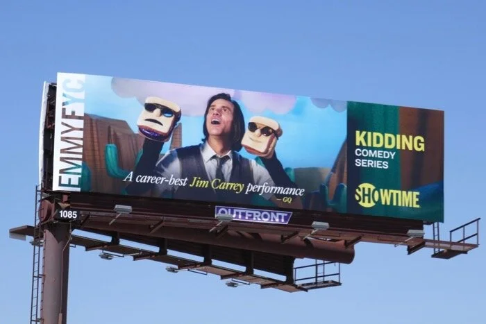
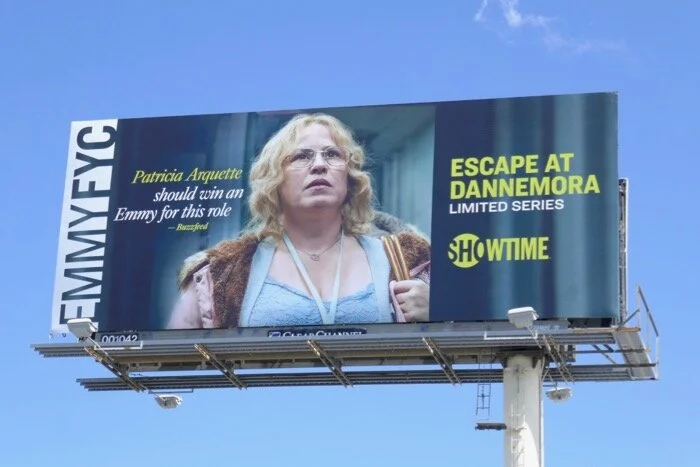
One frame, filled differently. The system splits every execution into two zones. On one side, a still from the show with a critic's pull-quote set over it. On the other, a flat color block carrying the performer's name, the category they are nominated in, the show title and the SHOWTIME lockup. Down the edge runs a repeating EMMY FYC ticker.
That structure is fixed. What changes is what goes in it: the still, the quote, and the color, which is drawn from each show's own palette rather than from a network swatch. Dannemora gets cold institutional greens and grays. Black Monday gets its pink and gold. Kidding gets muted daylight. Six shows read as one campaign because the frame never moves, and as themselves because everything inside it does.
The category line is doing quiet work too. "Lead Actress, Limited Series" is not decoration, it is the ballot line a voter has to find. Putting it in fixed type at a fixed position means a voter scanning a billboard at speed gets the one piece of information they need to act on.
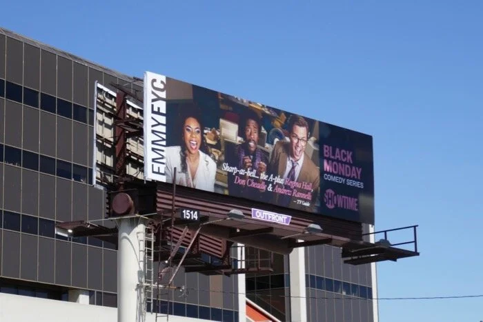
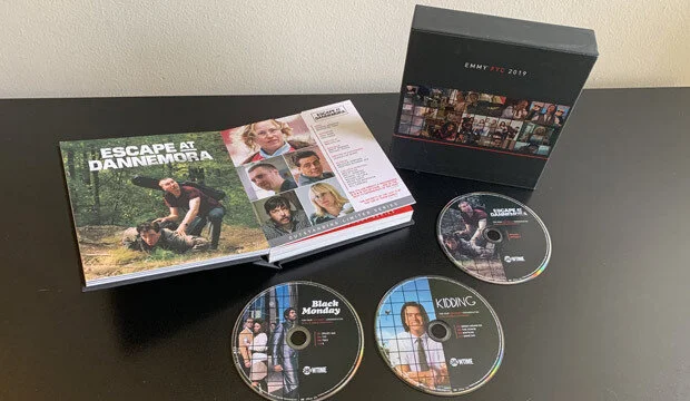
Built as formats, not as art. Rather than designing a poster and resizing it, each execution was built to its own placement. The billboards are landscape with the quote sized for a car, not a reader. The screener box, the printed book and the disc faces carry the same system at hand-held scale, where the type can get small and the still can breathe. The digital boards run as motion at 2732 by 330, a shape nothing else in the campaign shares, where the layout has to work as a horizontal crawl instead of a composition.
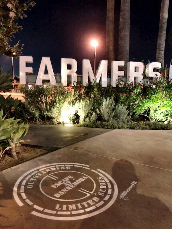
And one that was not a format at all. For Dannemora we stencilled the pavement outside the Farmers Market in Los Angeles, a few minutes from where a lot of voters were already walking. The stencil is a manhole cover, which is the tunnel the inmates escape through in the show, carrying the category line around its rim. It cost almost nothing and it put the argument underfoot in the one neighborhood where the audience was guaranteed to be.
Customer Journey
A voter meets this campaign four or five times without ever sitting down to look at it.
They drive past a billboard. They get a screener box at home and, if the packaging earns it, they actually watch a disc. They scroll past a vertical cut on a phone. They open a trade and see a page. They walk to lunch and there is a stencil on the ground.
None of those is a considered viewing. Each one is a few seconds, and all of them are competing with every other network doing exactly the same thing in the same square mile of Los Angeles. The system exists so those few seconds compound: the frame is recognizable by the third exposure, so by then the only new information a voter has to absorb is the name and the category.
That is also why the show stills carry critics' quotes rather than taglines. A voter is being asked to make a professional judgment, and a line from The New York Times or Variety is an argument. A tagline is only an assertion.
Impact
The campaign ran across print, physical screeners, out-of-home, digital and guerrilla through the 2019 Emmy season, covering six series and more than a dozen nominations under a single system.
An honest note on outcomes. Showtime took nominations across the slate that year, including Patricia Arquette for Escape at Dannemora, but she did not win that category, and the Emmy she won that season was for a different show on a different network. It would be easy to put an award at the bottom of this page. A FYC campaign is one input among a performance, a season of press, and several thousand people's taste, and claiming a win for the artwork would be the kind of attribution I would not accept from anybody else.
What the campaign is accountable for is that Showtime's argument arrived in one voice, that each show stayed distinguishable inside it, and that it held together from a 2732 pixel digital board down to a disc face.
Learning
The constraint that made the system work was refusing to design the executions one at a time. It would have been faster in week one to make a beautiful Dannemora billboard, then a beautiful Black Monday billboard, and so on. It would have been slower by week four, and the campaign would have had no cumulative effect, because nothing would have been repeating.
The second lesson is about where the variable goes. Almost every decision in this campaign is fixed. The only things allowed to change are the image, the quote and one color. That is a very small amount of freedom, and it is exactly why a dozen executions produced by different hands under deadline still look like one thing. I have made the same argument since about component libraries, and it is the same argument: a system is defined by what it refuses to let you change.
The third is that the cheapest execution was the most memorable. The pavement stencil cost a fraction of a single billboard placement. It worked because it was specific to one show rather than reusable across six, which is the exception the system needed in order to not read as a machine.